Gone Gray
Over the years, I’ve read many articles and books that discussed strategies for minimizing phone use. Really, to even call them phones today is a disservice. Our cell phones are now computers that also happen to be able to make calls.
Cal Newport, in his book Digital Minimalism discusses a sensible strategy of giving each type of device a particular job. Web surfing goes to the desktop, reading goes to the iPad, mobile needs goes to the iPhone, etc. In this type of system, with each device having a discreet role, the theory is that if keep each device in its lane, you can maintain your technology goals. For instance, you’d stop scrolling on your phone in bed because scrolling is to be done on your desktop.
Any plan to reduce your dependance on your devices will require at least a small degree of buy-in. Most manufacturers are heavily incentivized to keep you plugged in as much as possible, so the tools to create a “healthy relationship,” even the parental controls, are difficult to navigate by design but easy to break.
The device job idea was interesting to me, but the idea that’s stuck even longer is a video that I watched in 2018 from The Wall Street Journal. Personal Technology columnist Joanna Stern did a deep dive on the colors on our phones, and how they use our psychology against us to keep us staring at our screens all day.
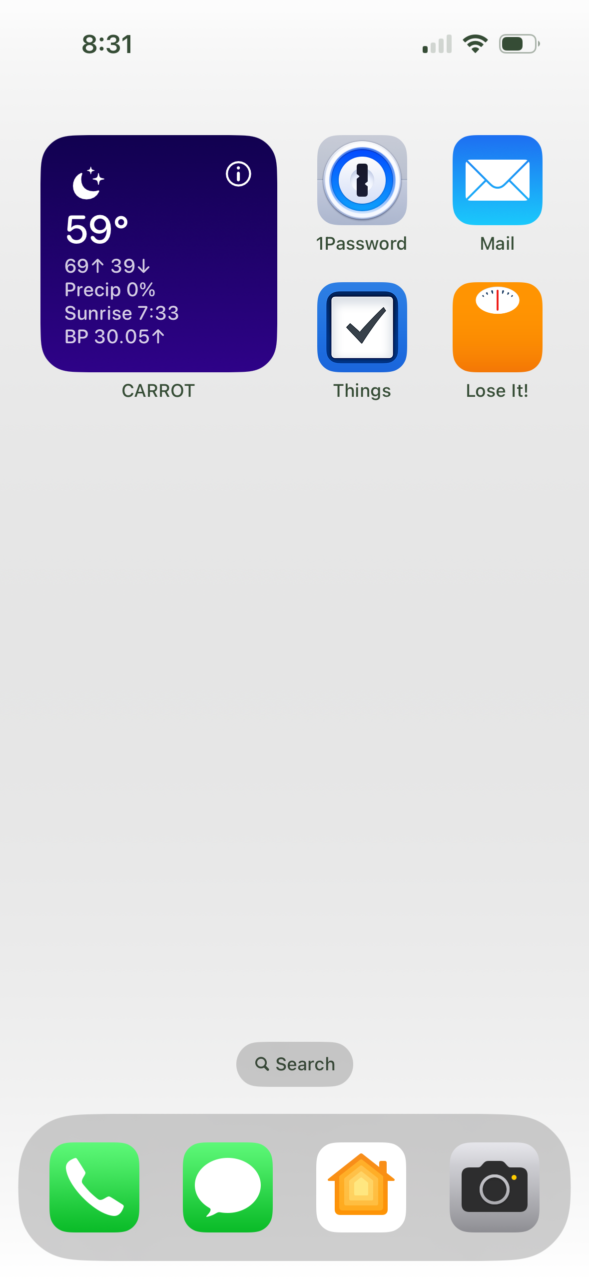
After six years of bouncing around in my head, I finally did it. I combined Cal and Joanna’s strategies into one comprehensive iPhone redesign. I deleted most of my apps, only keeping the ones that I need close at hand for short duration use. Gone are the games, news, and reading apps. I then set up a simple Home Screen with nine apps, the remaining accessible from a Spotlight search or the App Library. Finally, I turned on color filters and set the whole operating system to greyscale.

I then took things one step further. I finally sat down to understand the Focus modes, and set up several to match the phases of my day.
The collective impact of these changes is noticeable. I don’t reach for my phone in the idle moments of the day, and when it’s on, the grey is unbelievably uninteresting. There are times, if I am doing some quick online shopping, where I turn back on the color because color is context. When done, the gray is back on and my phone is back to its designated lane.
Technology is a wonderful thing that brings so much convenience to our lives. Regardless of its importance, at the end of the day, it’s just a tool. And it works much better in grayscale.
March 28, 2024